
Black, White, and a Splash of Blue - Oh, What's a Girl To Do???? I ended up making two cards, one for a guy birthday and one for a girl birthday. I couldn't help myself!!
This is a close up of the focal point on my guy card. The blue is a piece of chipboard which I thought made it manly! I dabbed blue ink on the gray chipboard. I ran the white background through the PTI canvas impressions plate.
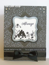
Here's the full view of my card. The top stamp and sentiment is from PTI Damask Designs. I also stamped text from PTI's Background Basics Text Style. I distressed the edges with black and used royal blue and black satin ribbon. The black jewels are from Doodlebug Designs.
This next card is my girly version. I used vintage cream instead of white and aqua for the blue because I had this FAB aqua velvet ribbon I wanted to use!
The black is grossgrain ribbon and the flower is from Making Memories - Black Tie. I ripped off the flower middle and used a black lacy metal brad from Spare Parts. Can you see the canvas texture from the impression plate? I LOVE this texture in person!
Here's the finished card. I backed the damask flower with aqua paper I cut out with my Marvey scalloped circle punch and I rolled the circle until I could separate the paper layers like
Lisa Johnson showed with her Poppy flower tutorial.
Sorry there are two cards but I was in the mood to create!!!
 Black, White, and a Splash of Blue - Oh, What's a Girl To Do???? I ended up making two cards, one for a guy birthday and one for a girl birthday. I couldn't help myself!!



















15 comments:
So pretty. I love the flower!
Love your cards! Just my style. I'm new to the PDCC and having a ball visiting everybody and getting very inspired!
Beautiful cards, wonderful Damask image. Thanks for playing at the PDCC.
Wow! Two equally beautiful and gorgeous cards! Glad you decided to create both and play in the PDCC!
Both of these cards are gorgeous Sue! I like how you created 2 versions! I am partial to the girly one :) Thanks so much for playing along with the PDCC :)
Sue, stunning cards!!! The damask black and white flower on the girlie version is awesome! But you totally rocked both the masculine and feminine versions :) Don't you just love these color splashes? You added just the right amount of color "punch" - I LOVE it!!!
Your cards are so dramatic and beautiful!
Both are wonderful. Especially the second. I think I like the softer blue. :)
How fun is this, I love that you have the girl and boy card, so cool! Thanks for stopping by my blog to say hello! : )
Oh wow, these cards are simply beautiful (though I must confess I have a aesthetic weakness for flourishes and damasks designs). The flower is particularly elegant too, love it. Pxx
Wow, both cards are just fabulous! Really like the 2nd one! The flower.... yummy!
Beautiful cards - I love the damask background stamp!
These are both gorgeous, Sue! Love the combination of damask and text stamps.. your flower is fabulous! Thanks for playing with the Play Date Cafe!!
these are both gorgeous, sue:)
Just beautiful...simply beautiful! So glad to have them featured at The Play Date Cafe :)
Post a Comment